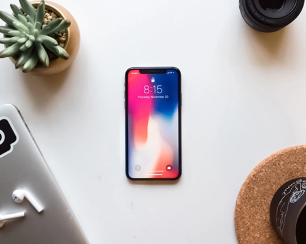
Mobile.
Ready.
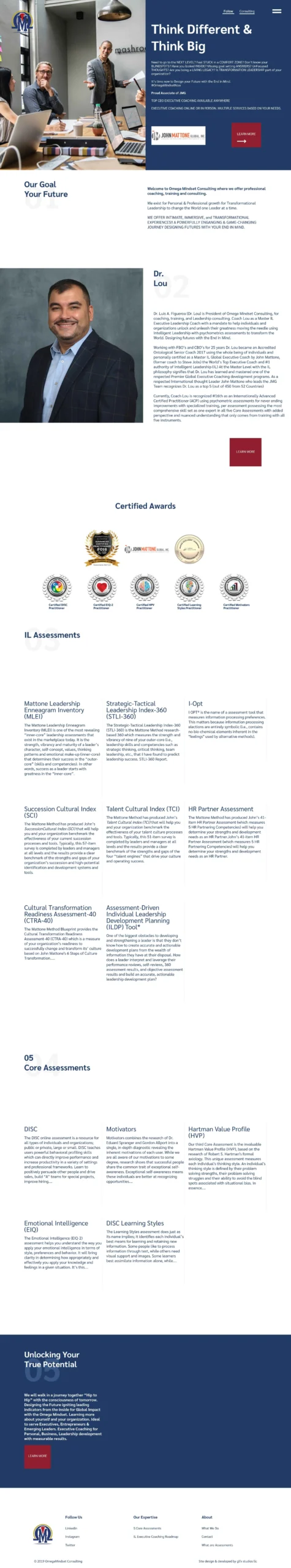
Like the majority of our sites, this site was designed with mobile in mind. We wanted to give the user a flawless experience when they switched from desktop, tablet, and then to mobile. The navigation icon is one of the key elements to making this possible and gets the user acquainted with the menu icon to ensure a similar experience. Lastly, we utilized our custom-built grid layout, so when it reaches the mobile view, it quickly responds to that size.
