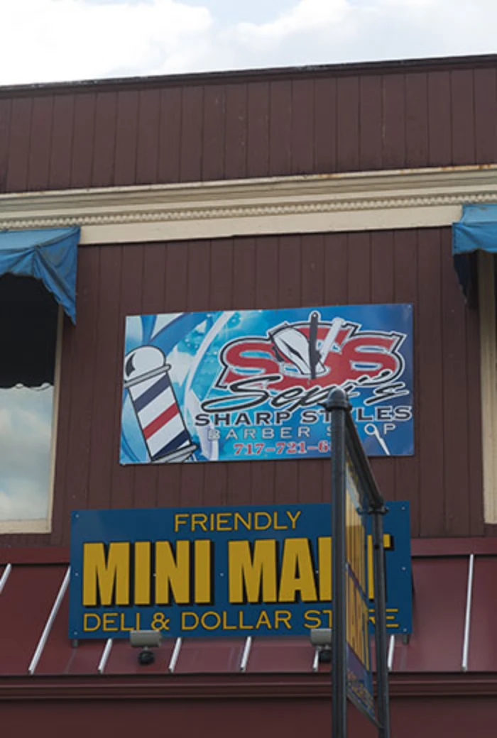
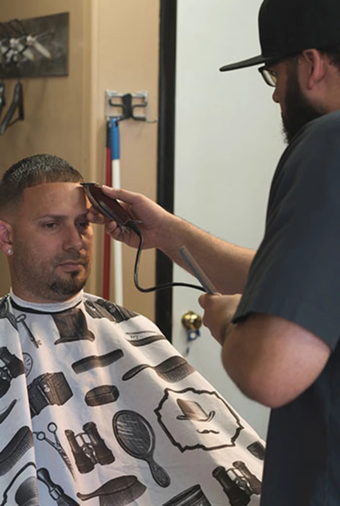
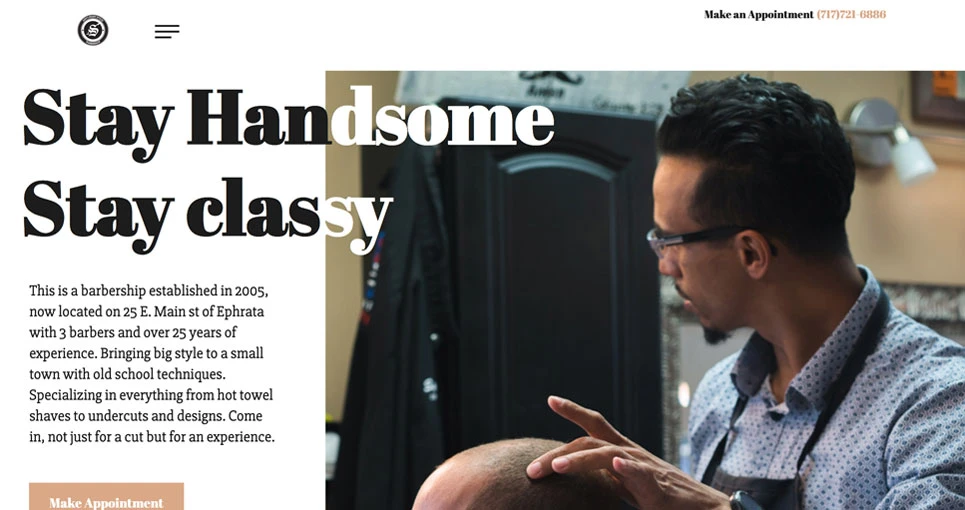
Sepi’s Sharp Styles Barber Shop commissioned us for a website and logo collaboration. They were aiming for a rustic and modern aesthetic that matched their unique barbershop. Whenever possible we love to visit the businesses we work with to get a feel for their chosen aesthetic so we can best fully represent them using our designs.
We here at GLFX love to have client creative requests because we are here to help you express your passion and your business. This client wanted it to be immediately obvious by looking at the logo that they were a barbering business and asked that we implemented a few small details into their design. Sepi, the owner, asked that we represent a straight edge (hair design) and barber scissors in some type of fashion.
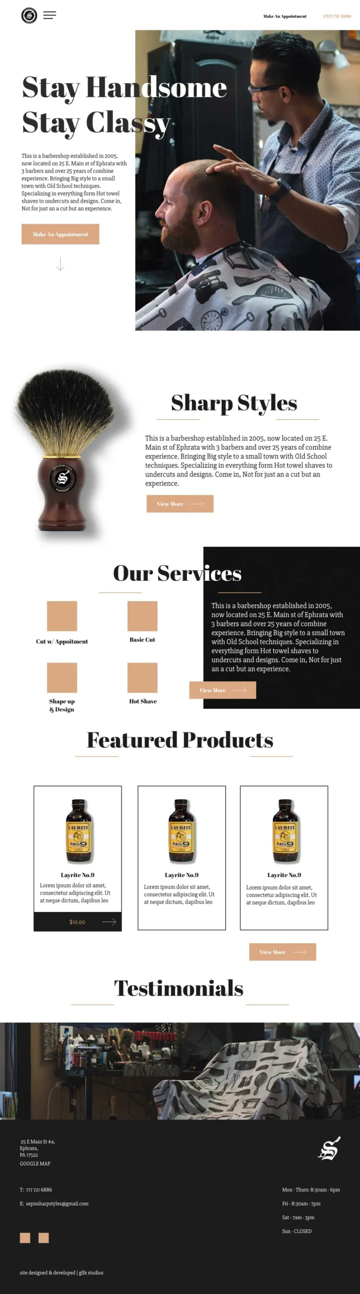
Our lead designer Pedro Madera was able to capture the feel of Sepi’s Sharp Styles using his artistic touch and many years of design experience partnered with research on rustic design. What he ended with was a remarkably simple and fresh design that represented the barber shop’s feel perfectly.
The website’s font type was based on the final logo design from our lead designer to give their site more of an integrated appeal. While a serif font was used for the headlines, a san-serif was used as the body content, so there would be a balance between classy and modern. The modern sans-serif font also made the legibility of the content easier for the user.
In order to make the aesthetics of the site and barbershop come together, we incorporated the overall color scheme of the barbershop into the website with a light tan and a mid-tone black. It’s best to tie in the atmosphere found in the barbershop to the website, giving users the same impression they get when they first walk into the shop.
Every site we develop is designed to a mobile-ready standard. This is essential in the age of cellphones which comprises over 80% of online traffic. We chose to have the site responsive for the most popular screen sizes by client request. We went as far as having the site respond to even the biggest sizes, considering screens aren’t just getting smaller they are increasing as future models come out. By doing this, we made the site adaptable as future trends ebb and flow with mobile devices–and so will Sepi’s site.
Testing the global capabilities .Description to the user to engage or fill out the form.