Steve's
Automotive Technology
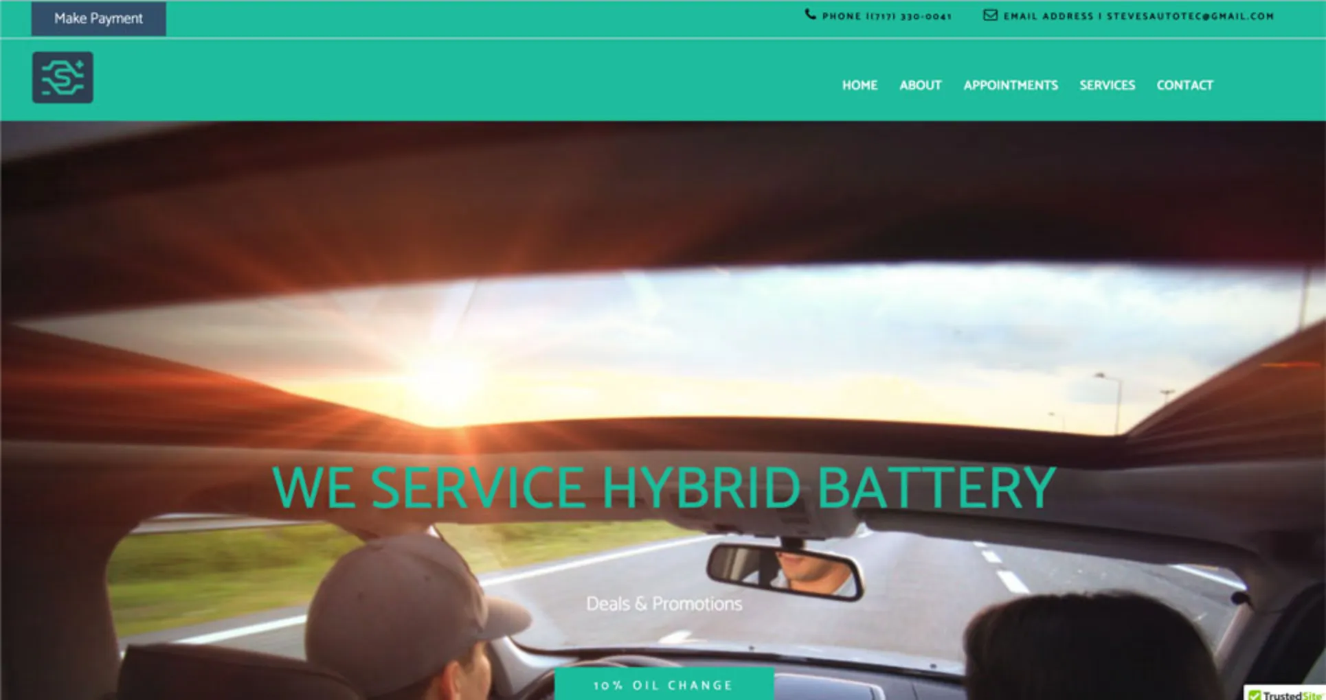
During the branding process, the initial idea was to create a logo that accentuated auto repair and Steve’s Automotive Technology as a whole. To do that, our graphic designer, Benjamin Wood, wanted to incorporate a battery, Steve’s name, and the plus and minus symbols.As the final logo came into fruition the icon showcased a geometric version of a car battery with the plus and minus signs on opposite ends and an “S” in the center to bring the icon home.
The type logo made use of the plus and minus signs to better relate with the icon and the font “Catamaran, sans-serif” brought a clean simple look. The first concept emphasized the electronic system maintenance. It is an extraction of the positive and negative charge of a car battery, which is designed into the logotype, complemented by custom lettering.
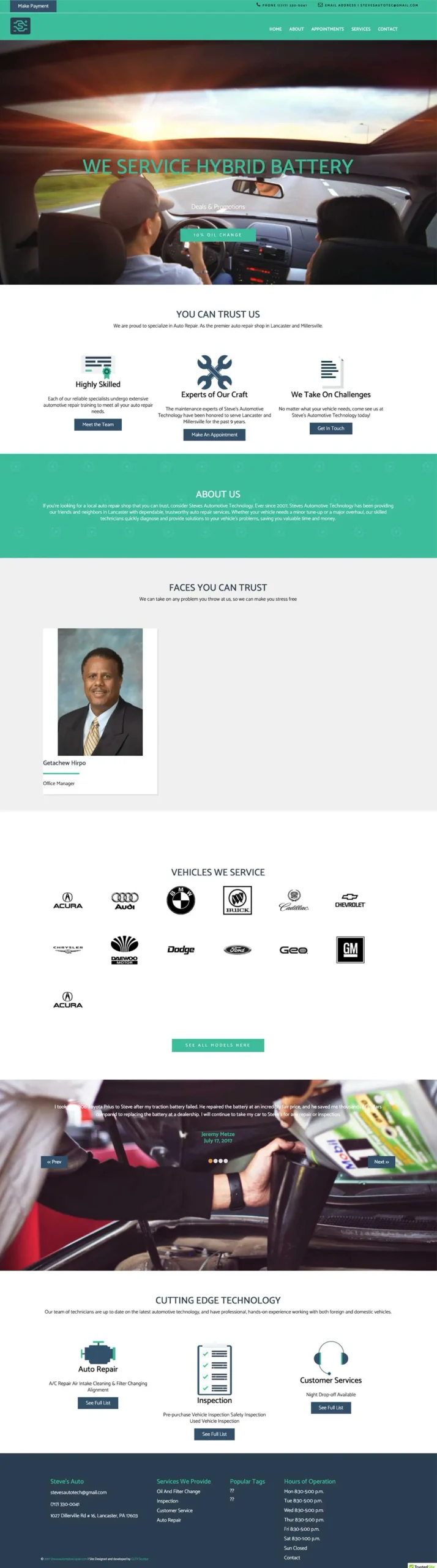
Next, our lead front-end web developer, Justin Watson, and the lead back-end web developer, D’Andre Guess, worked together to construct the well-organized website. The site integrated the light green and navy blue from the logo into the website to present unity, a basic in branding. We also built a form requested by Steve, for existing or potential clientele to fill out and submit auto repair requests. It is important to tie in the clientele’s company and its connection to their community, so we added an employees section and testimonials to the home page.